Load-in Micro Animations
Purple
I loved working on this project.
For a long time, I have been deeply interested in motion design and have often created small motion studies or projects. This passion has bled into my UI/UX work in different ways, and this project gave me an excellent opportunity to delve into the more technical aspects of UI motion.
Role:
Product Designer
Disciplines:
UI/UX
Motion Design
Background
While I was at Purple, a big effort by many designers was the redesign of their UI. Purple collaborated with Instrument, an amazing studio, to create the initial design guidelines. My role was to implement the new system, working cross-functionally with the brand, development, and product teams to launch the new design system.
As part of this effort, I frequently pressure tested components to ensure that design decisions worked as expected.
The load-in animations are an example of where the system fell short.
The Ugly
“Why are these load-ins so awkward?” was the common sentiment from the product team. However, since the animations were so subtle, it could be challenging to pinpoint the issues. Fortunately, our team was filled with detail-oriented people who noticed the following:
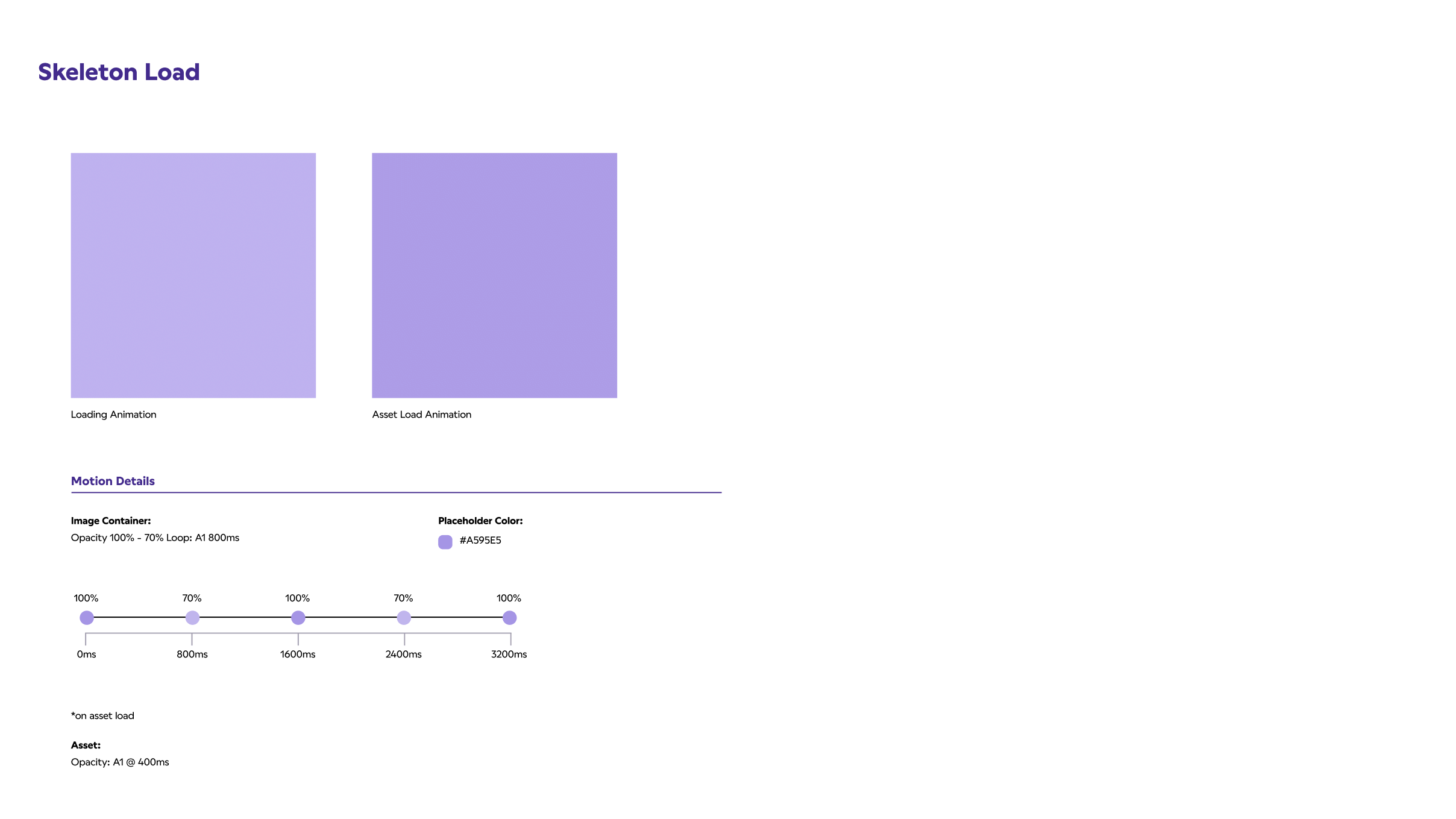
- The skeleton load wasn't working properly. This is really easy to miss, since it could be a very short state at the beginning of the load.
- The "swipe" load used for the images was jarring and disorienting, as it diverted attention away from the content.
The type load needed attention as it didn't feel natural. - Overall, the current loading states felt too prominent, loud, and lacked purpose.The following video shows the loading animation before I worked on it.
Goals & Results
Ultimately, we wanted load-in animations that aligned with the Purple brand and voice, but didn't distract from the content on page. When discussing what we wanted, we used words like "subtle" or "restful." Think of the feeling of a Purple bed (which I recommend trying if you haven’t)—let's make the animations a little bouncy, but soft and dreamy.
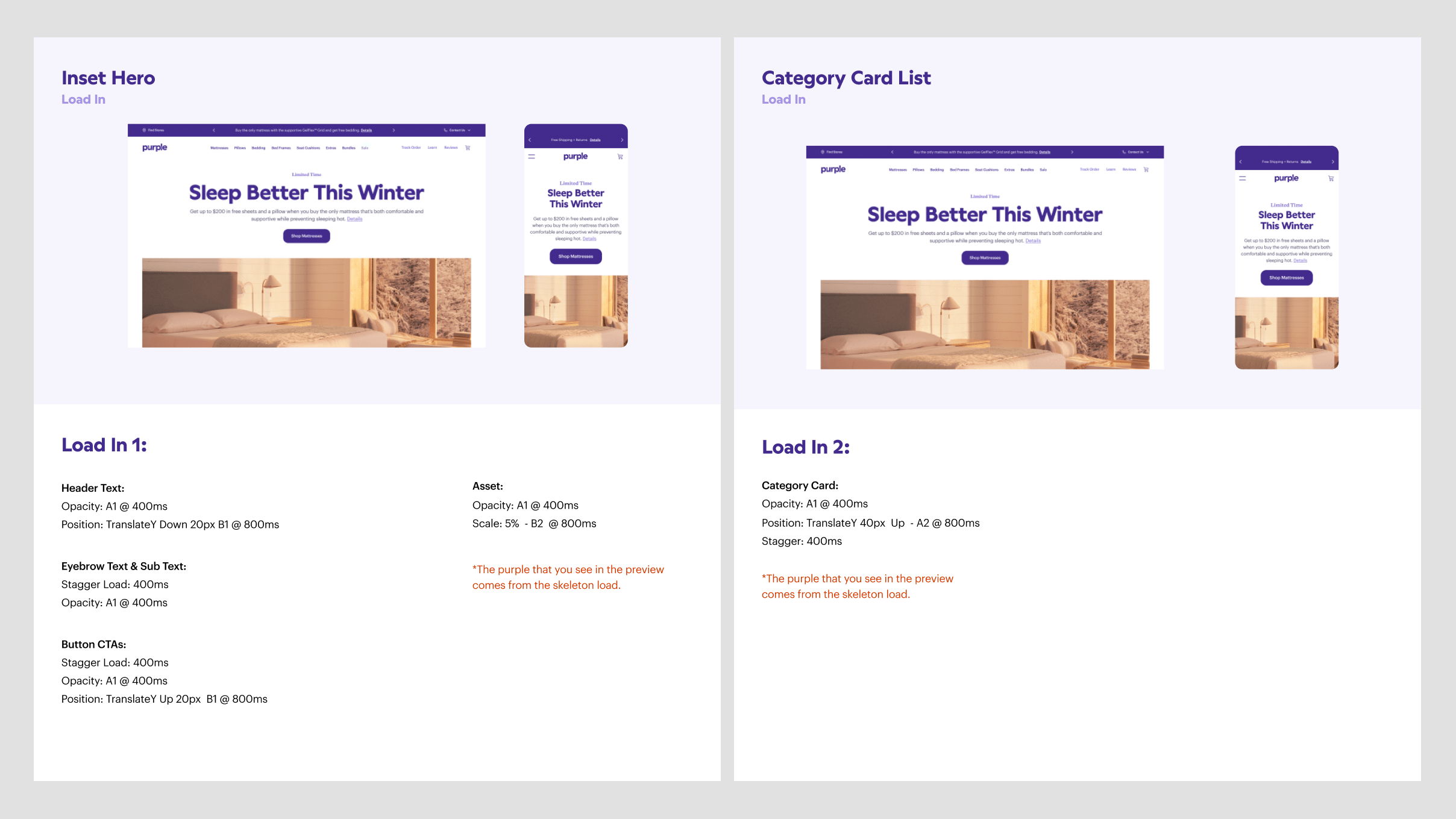
For the “Inset Hero component” I removed the swipe animation on the image and added the subtle text/button fade in. The header text slightly falls and rests above the copy text, while the CTA button bounces, as if on a mattress.
For the "Product Card" component, I removed the swipe animation and added fades for the images. I staggered the load times and added a very subtle bounce in the transition. You can find the specific specs for these components at the end of the case study.
The overall feel of the new animations doesn't distract from the content but adds interest to the load-ins. The brand team was excited about these touches, and the development team was excited about the code challenge the new animations would bring. ;)
The Nitty Gritty
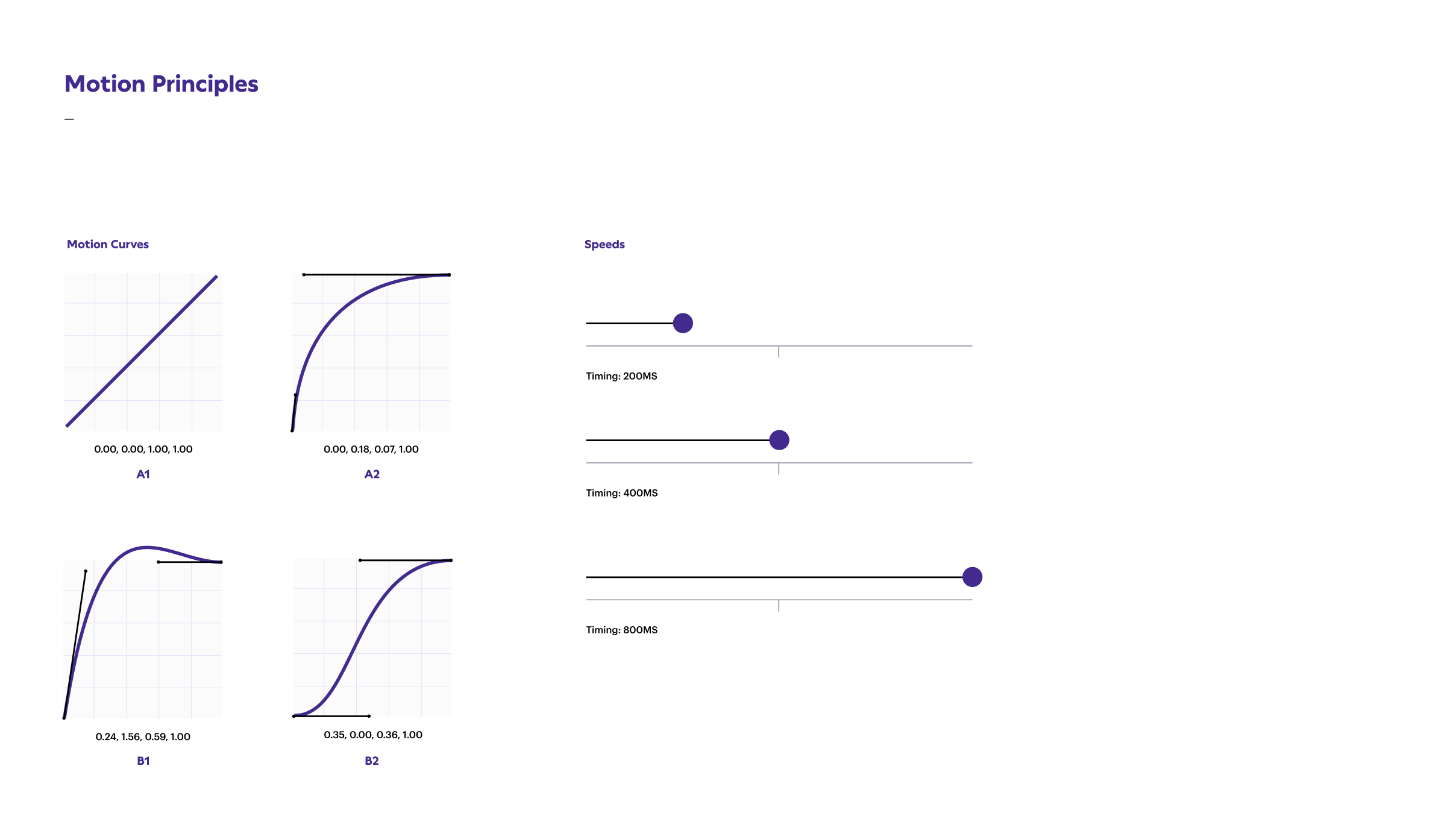
Diving into the more technical aspects of UI motion was a great learning experience with this project. I think the industry, including myself, relies heavily on Figma's prototyping tools to add animation in UI, which can be limiting. I was very mindful of timing and custom motion curves for the load-ins, which felt more like crafting the experience rather than just adding something quickly to be done with it.
Below is the documentation we handed off to the development team, which described the specifics of timing, custom motion curves, and staggered loads that created the final animations. For example, the B1 motion curve created the subtle bounce seen in the CTAs of the Inset Hero component.