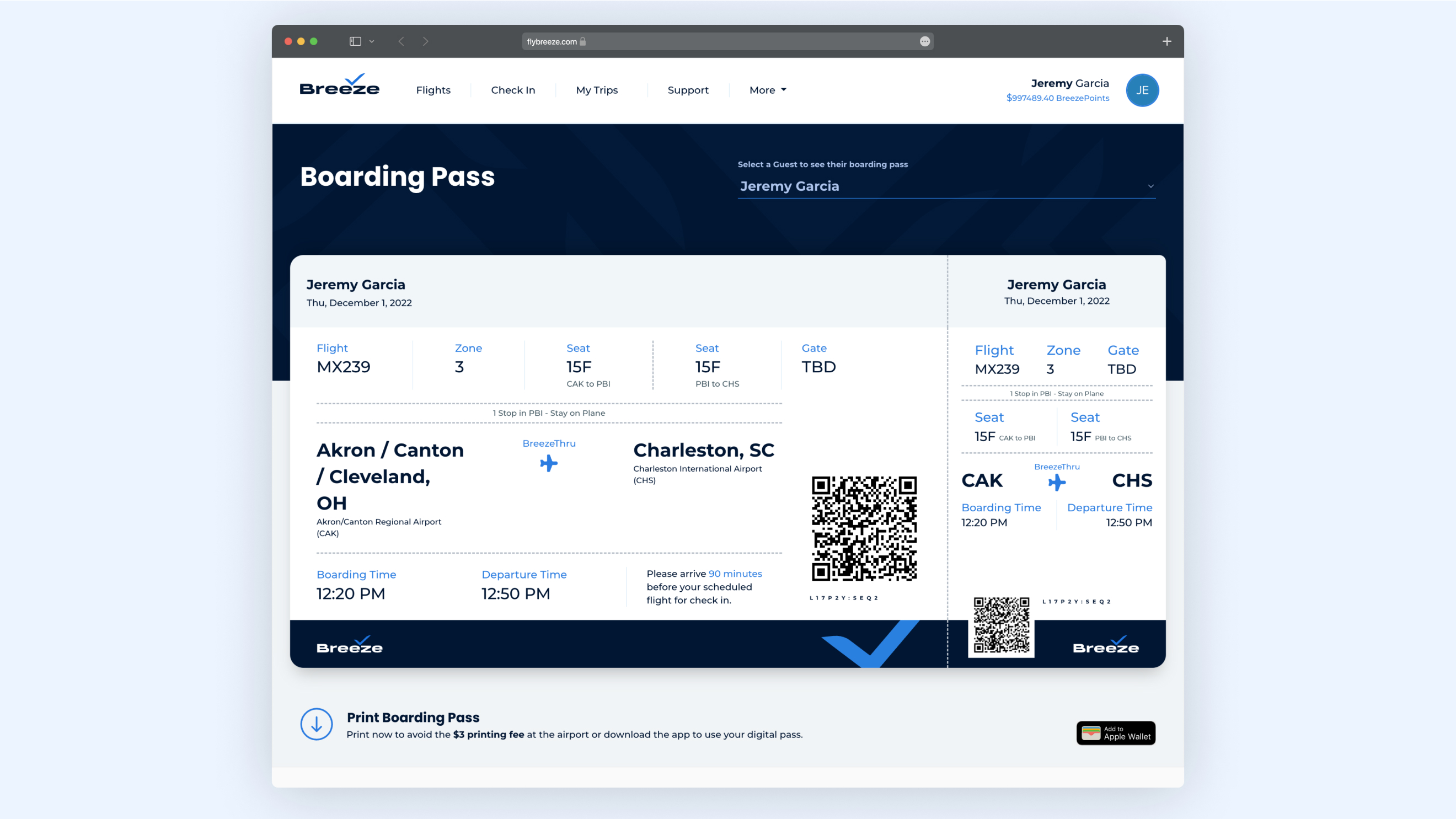
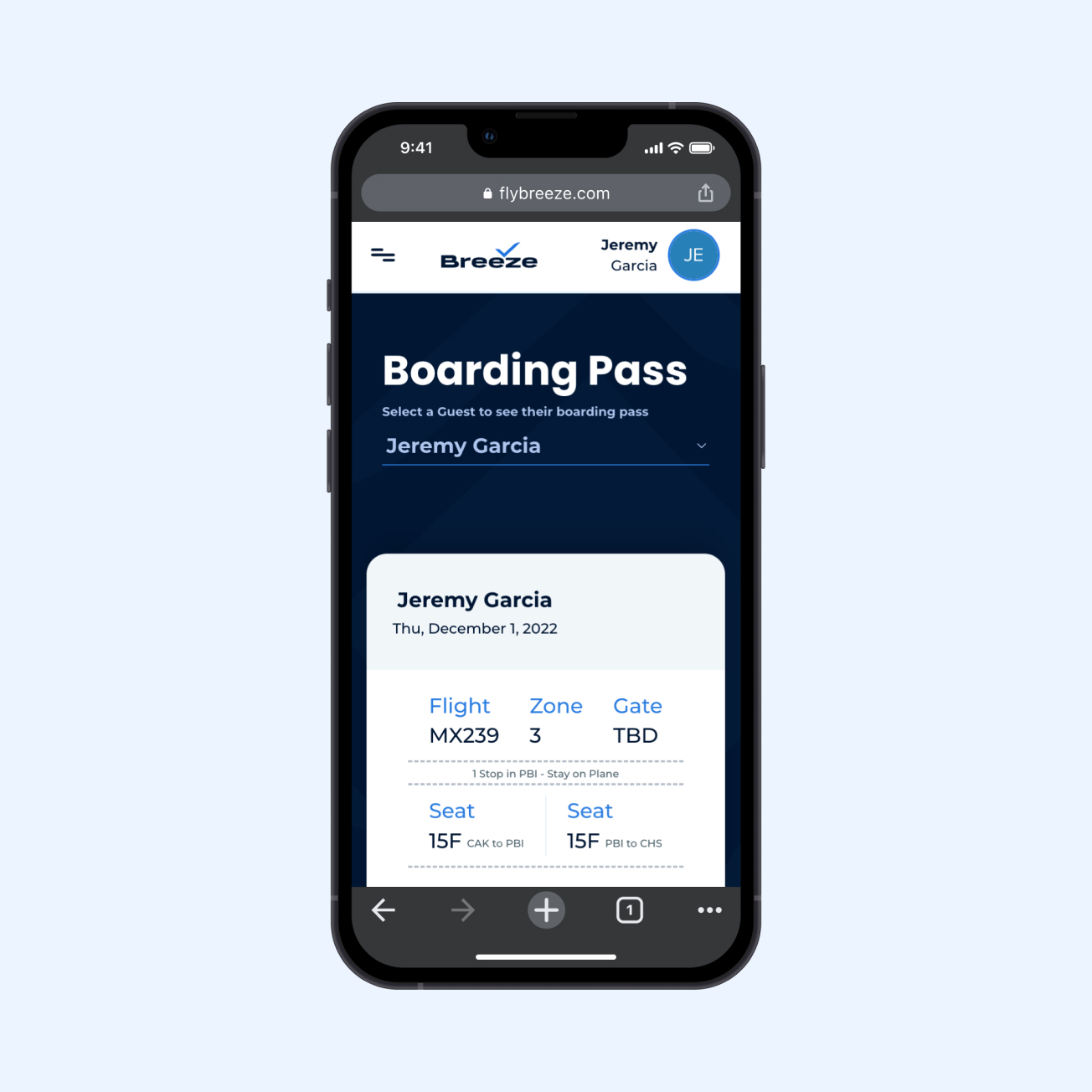
Digital Boarding Pass
Breeze Airways
Breeze is growing rapidly, and like any growing startup, it is constantly pivoting, updating, streamlining, and launching new products. The boarding pass redesign is a small part of its efforts to add connecting flights to its product lineup.
Before this project, the boarding pass experience was disjointed, with no clear hierarchy of information and a lack of modern UI design. However, the improvements made in these areas, along with in-field testing, have resulted in a much-improved experience for guests.
Role:
Product Designer
Disciplines:
UI/UX
Year:
2023
Background
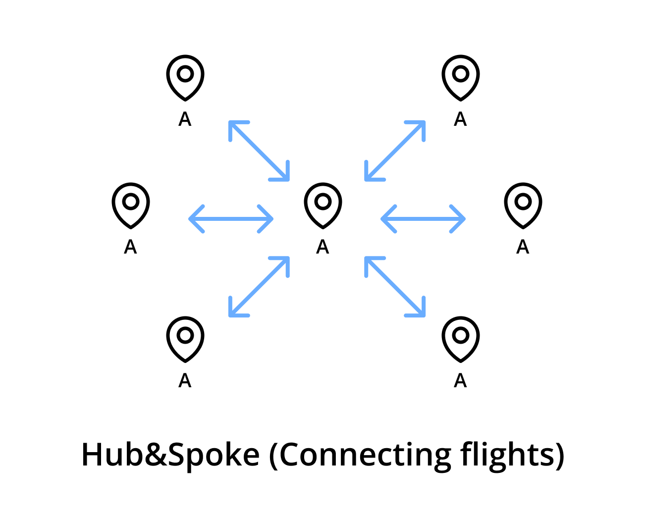
Initially, Breeze launched in 2020 as a point-to-point airline, which meant they only sold and operated one-way flights without any connections or stops. This model is common among low-cost carriers and simplified the technology and operational requirements for the launch.
As Breeze's capacity increased, it became evident that the revenue benefits of adding connection flights outweighed the technical costs of developing and launching a connections product. Customers had embraced the point-to-point product and wanted more access to additional markets, which connections could provide.
Implementing a change like the connection flights site-wide was a massive undertaking for the entire company, and I will be highlighting a small but crucial aspect of the project in the "boarding pass."
The Identifying The Current Problems
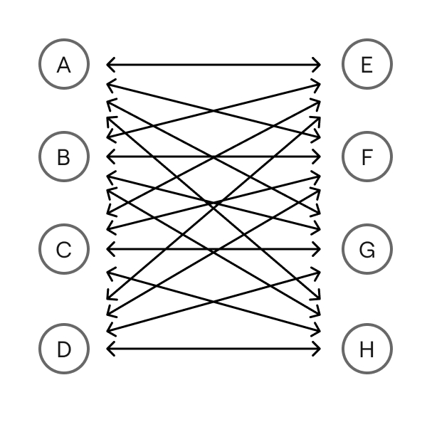
Incorporating connections into the Breeze system significantly increases its complexity. New requirements for boarding passes include communicating information for multiple planes in a trip, multiple boarding and departure times, different seat assignments, distinct QR codes for scanning, and more.
In addition to the challenges posed by adding connections, the current boarding passes require a redesign that addresses three key issues:
1. Usability problems
2. Unnecessary skeuomorphism
3. Unifying mobile responsive and app components.
Problem 1: Usability Issues
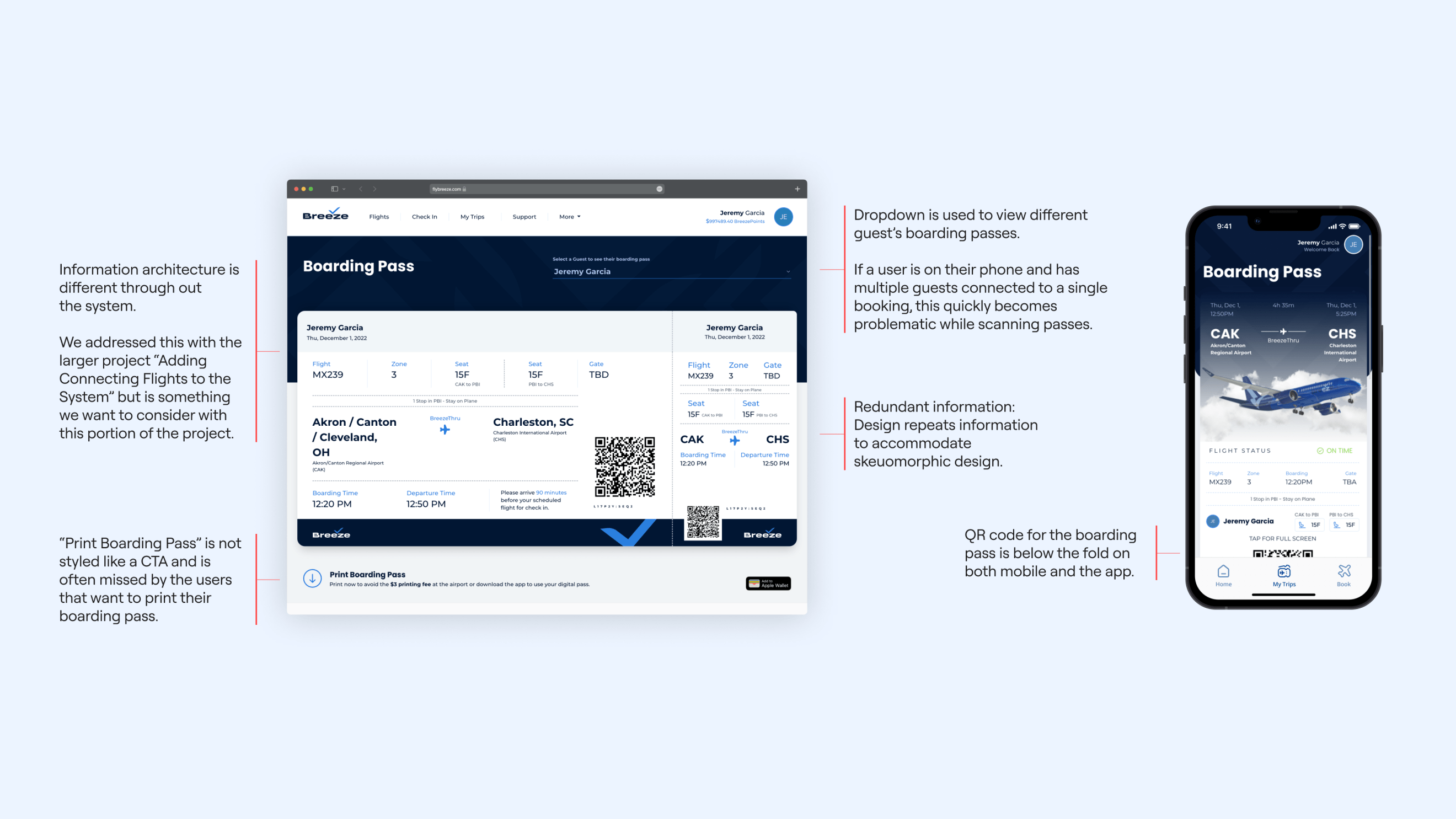
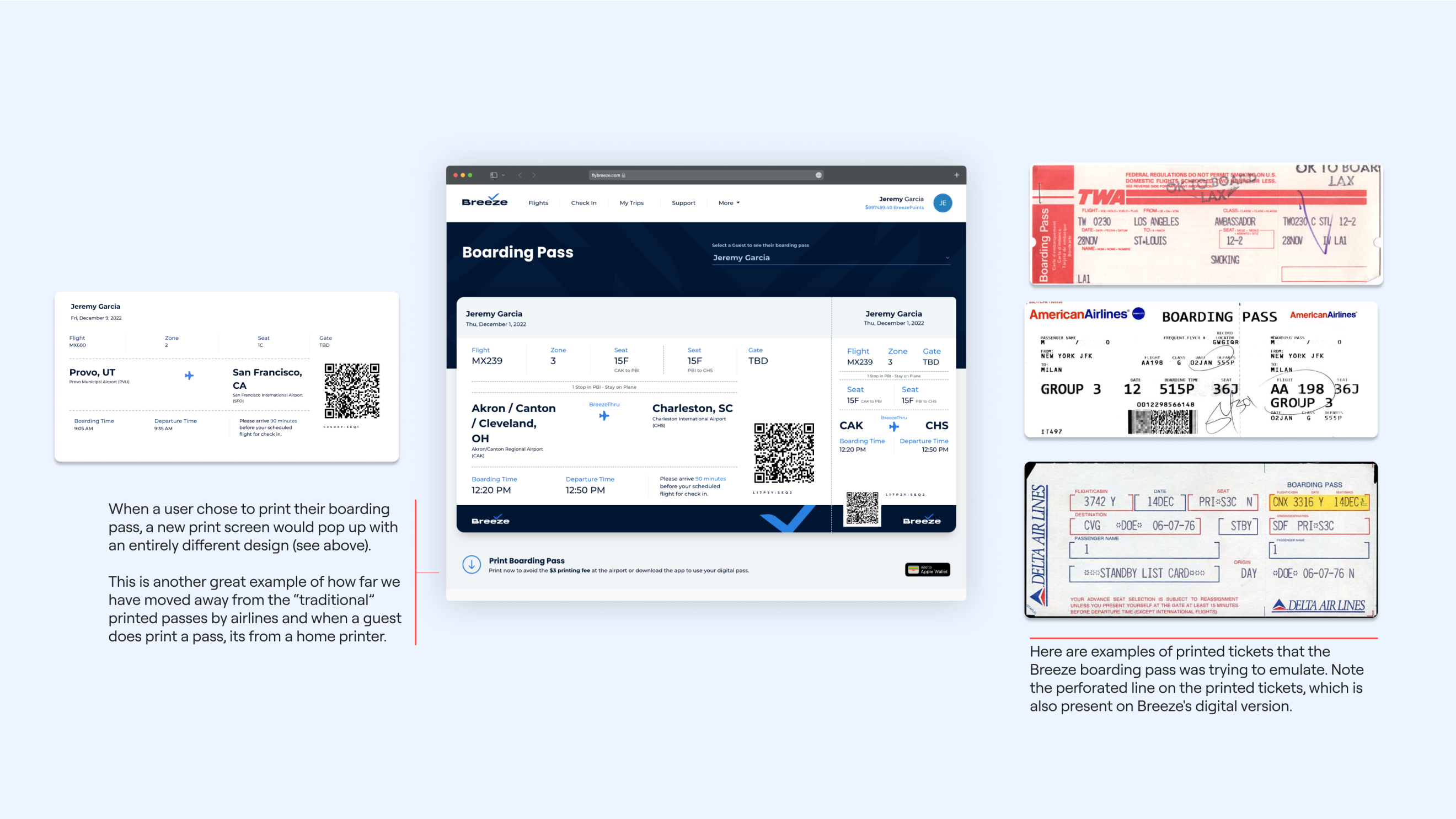
Problem 2: Unnecessary Skeuomorphism
The airline industry has come a long way from printed boarding passes, with digital passes now being the norm and passengers expecting them.
By adopting current digital design trends and moving away from unnecessary skeuomorphism, Breeze can move closer to the mission of being a tech company that happens to offer air travel services.
Problem 3: Unifying Mobile and App Components
Our decision to unify our mobile and app components is part of a broader conversation with the front-end developer leadership and product leadership about our tech stack.
Historically, Breeze has struggled to settle on a front-end framework, which has resulted in inconsistent design depending on the UI library used by different developers.
When I joined the team, I spent time with the product and development leadership and realized that teams were not aligned on the tech they wanted to use.
Additionally, while the app used the Ionic framework, the web and mobile responsive experiences did not leverage the same framework. This caused significant differences in user experiences and made redesigns and iterations difficult.
Given these challenges, it was clear to me that we should aim to be technology-agnostic, creating components in simple HTML and CSS that can be connected to whatever technology each team is using.
While this approach may require more work for designers in the short term, it will ultimately make it easier for us to unify our experiences and conduct design iteration and testing.
This change will also facilitate future changes to our development tech stack, which appears likely given the stage Breeze is currently in.
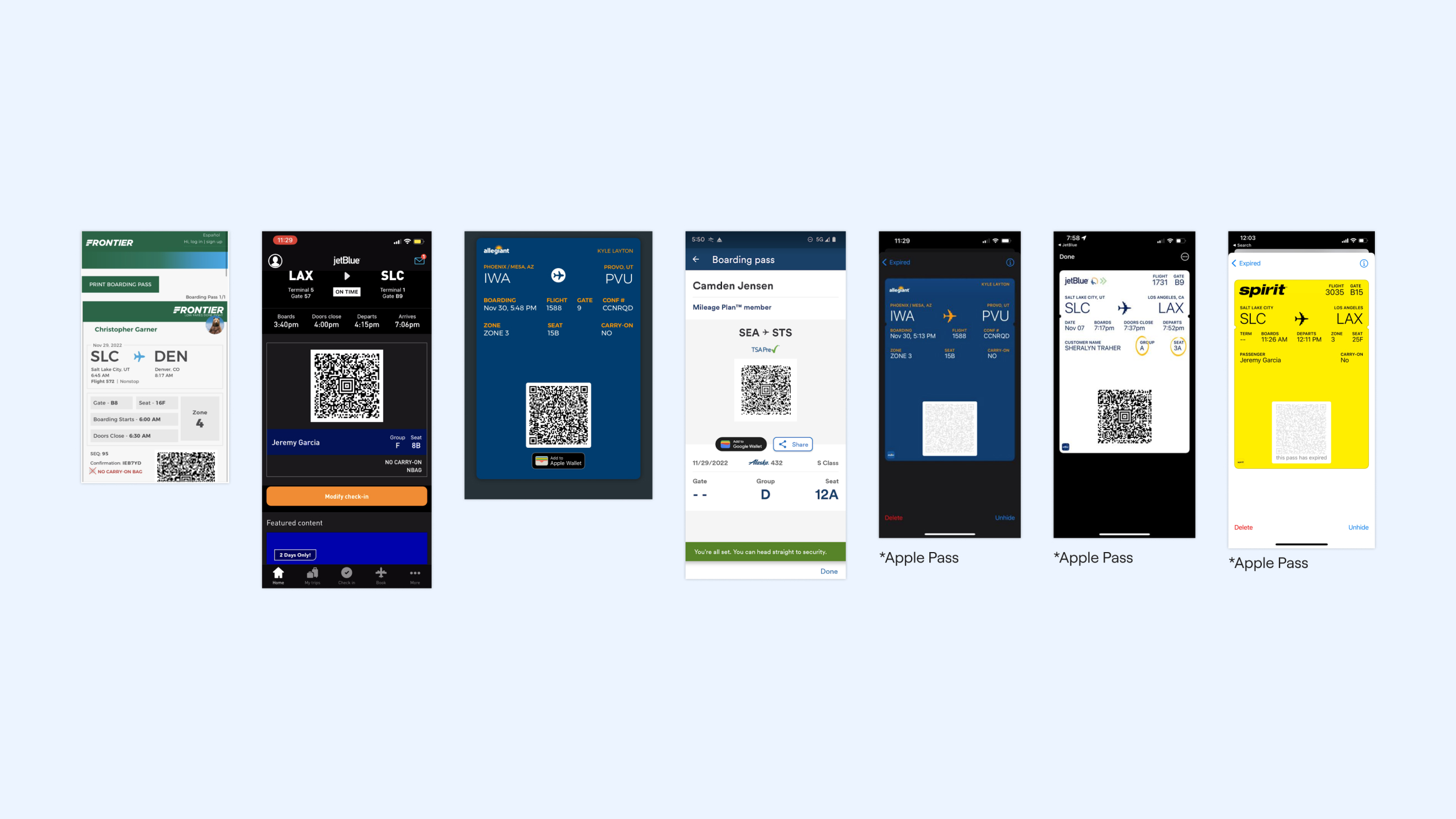
Competitive Audit
I collected passes from our competitors to analyze how they organized information, both on their individual apps and through other pass services. You can see some of these in the screenshot below.
Each of these passes leaned into digital pass UI patterns, which confirmed that we should move away from our current skeuomorphism design to get up to the industry standard.
In addition to this, I wanted to incorporate the following elements into my upcoming designs:
- Large QR codes: Most examples kept these above the fold.
- Airport codes: These are some of the largest items on the boarding pass, so they should be easy to see and read.
- Simple design: The simpler passes seemed to be more successful. They were easier to read and easier to use.
I believe that incorporating these elements into our designs will help us create a more user-friendly and visually appealing digital boarding pass.
Layout Explorations
I always enjoy refining the UI. First, I created low-fidelity mockups and conducted in-office testing to ensure that I covered the correct information expected on a pass.
The user journey, particularly in airports, was considered for the information hierarchy.
Then, after brainstorming and additional sketches, I created three separate directions we could go with the UI. After several rounds of stakeholder reviews and additional in-office testing, we refined the designs.
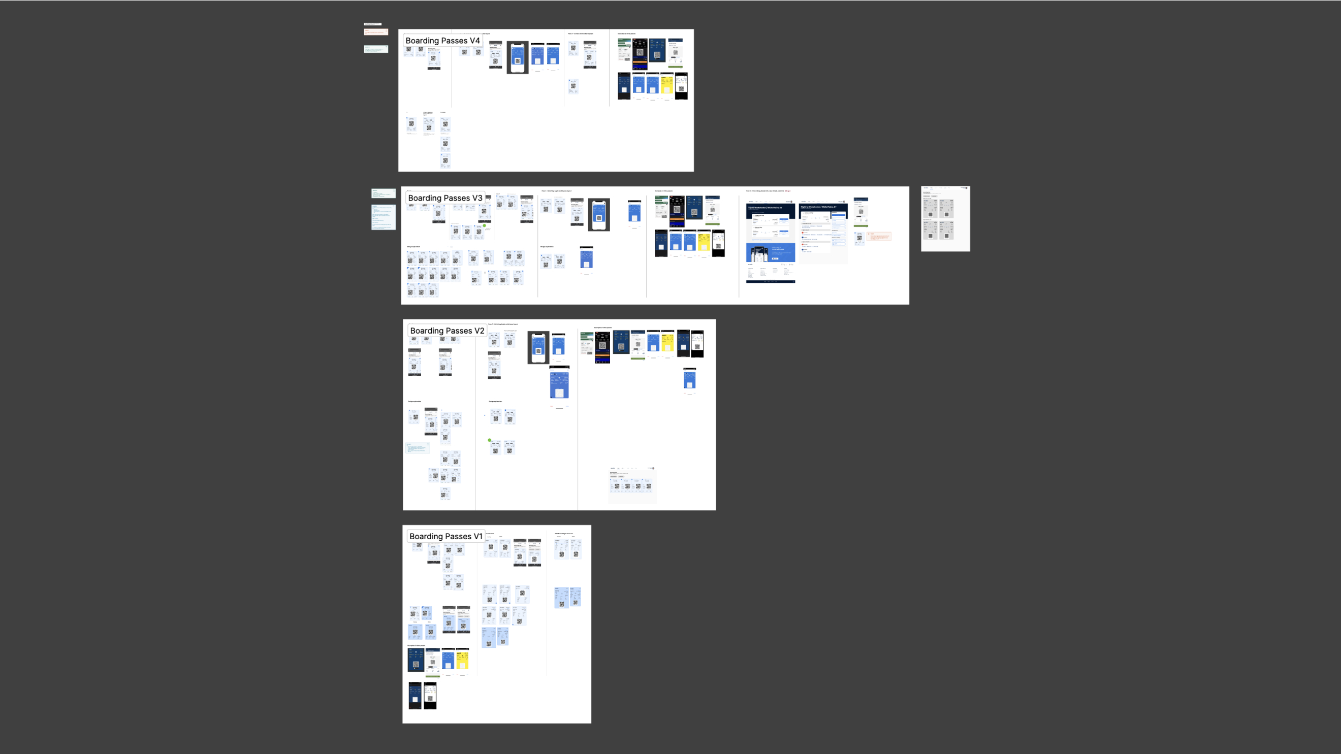
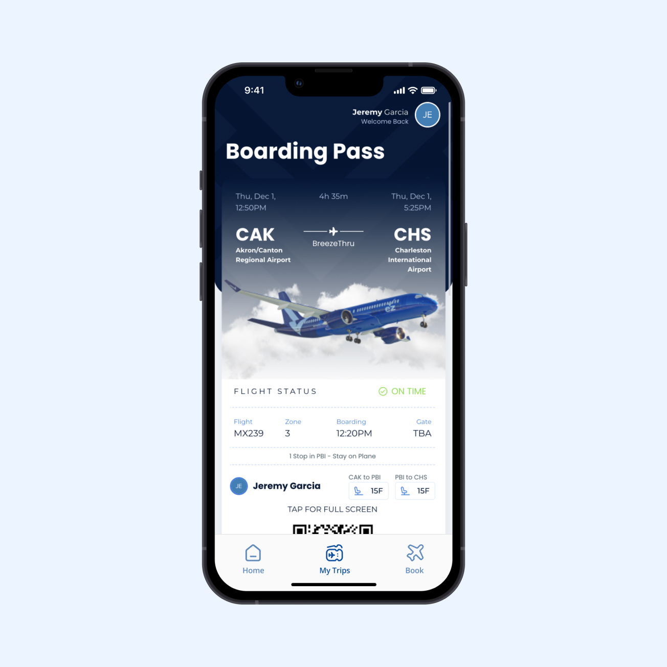
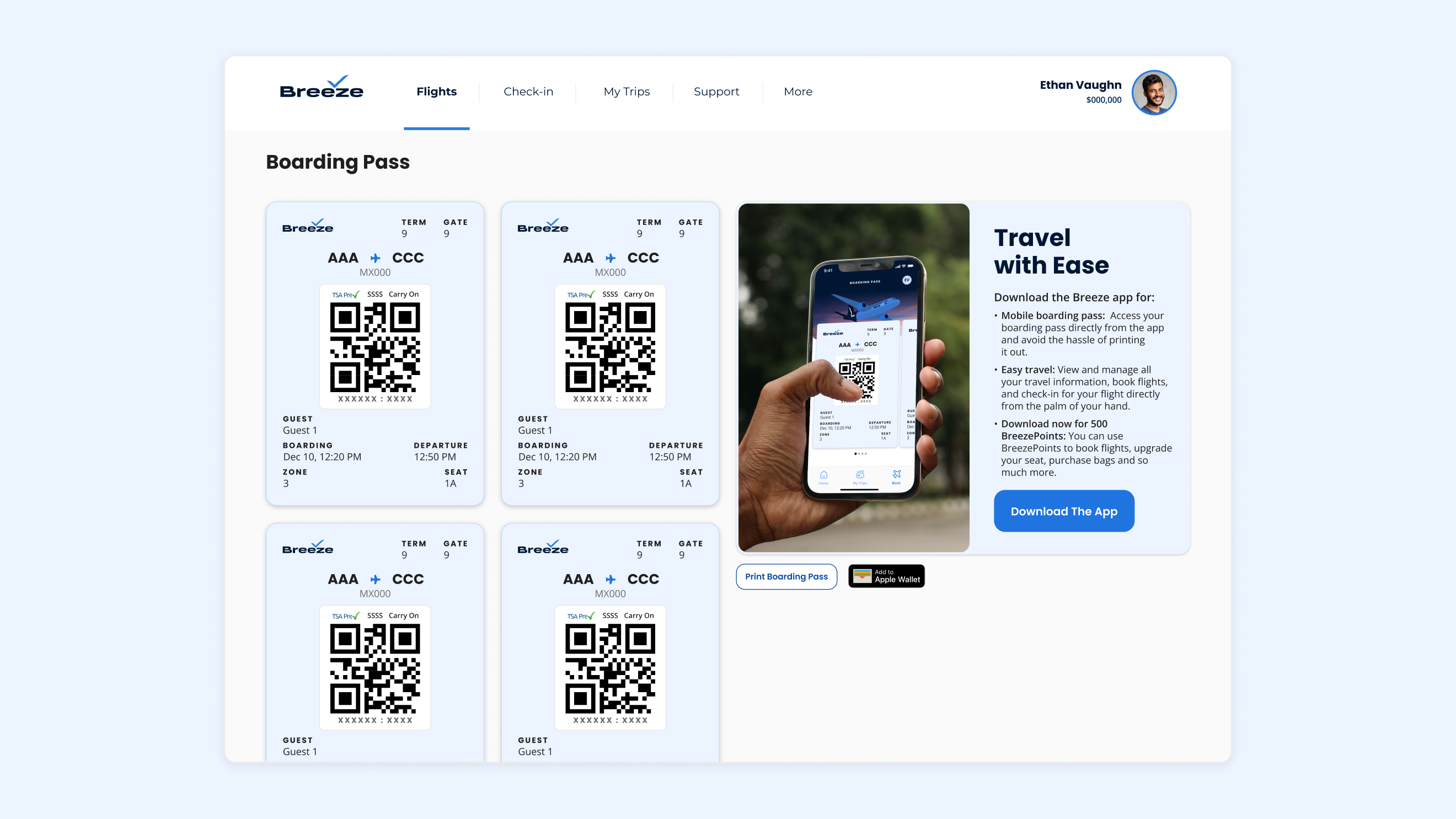
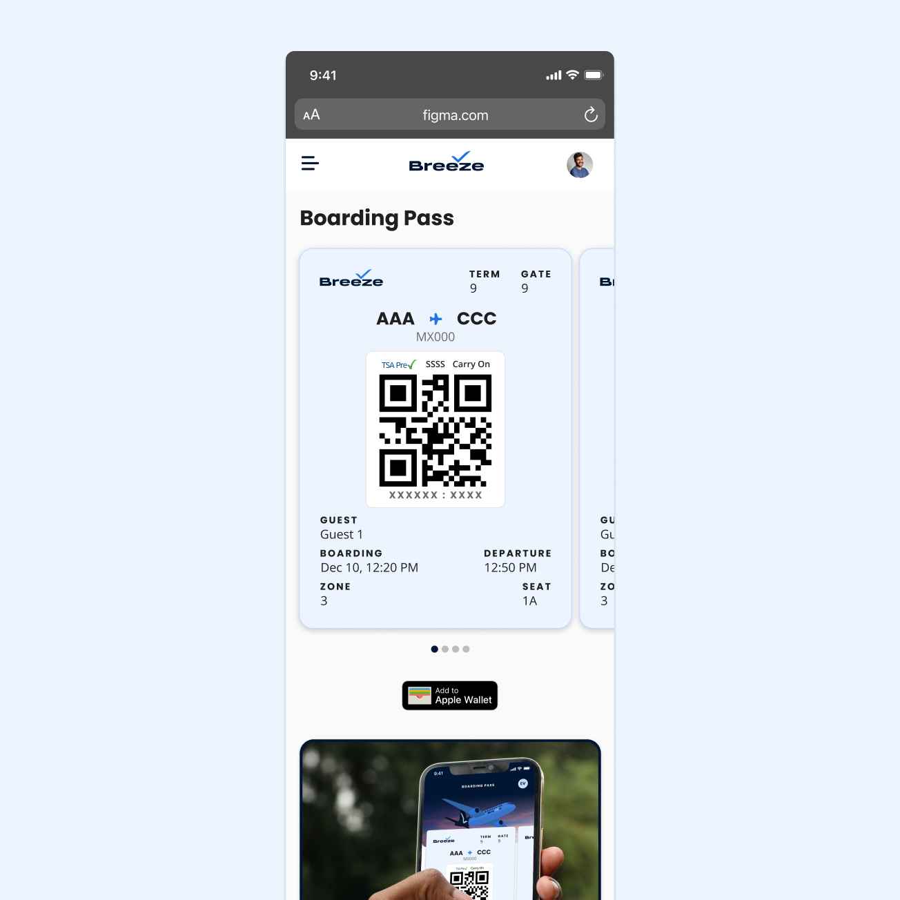
Where we landed
In-field Findings and Next Steps
A few of us from the team—myself, our PM, and a couple of devs—flew from PVU to SFO to test the new boarding passes and other changes we had made.
The boarding process was noticeably quicker, especially for guests with multiple people on their booking. We believe this is due to the new “swipe” interaction, which allows passengers to quickly cycle through multiple passes.
Gate attendants were also grateful for the new placement of the QR code.
After interviewing guests who used the new boarding passes, we learned that the boarding date and time needed to be adjusted. The current format made it difficult to read the boarding time, especially when the date and time were placed together.
We have created tickets to address this feedback and will implement the changes as fast follows.
Overall, guests reported positive experiences with the new boarding passes and appreciated the updated design.